 Tweet
Tweet
Originally posted by Lardarse
View Post
Exactly. The size of the banner is very long width wise, only so the banner will continue to appear on very large resolutions. But just because it's extremely wide does not mean you need to utilize the entire size to fit your design and look. As Lardarse said, keep your main design, text, logo, etc. to the first 640 pixels or so (starting from the left). The rest of the width should simply contain a background picture or something similar just to fill in the space for larger resolutions.
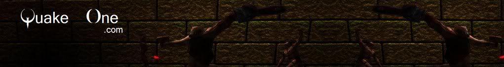
If you look at the current header graphic:
http://www.quakeone.com/mkportal/tem...one/header.jpg
You'll see it's just a mirror image of the first half. The main "content" of the graphic is over to the left and the rest is just "filler." I'm not saying you need to mirror your image, but just take notice that the portion that most will need to see to define what site you're on should be on the left side of the graphic. The rest may not necessarily be seen unless people have higher resolutions.


 MSN:
MSN:
Comment